Comotion
Context
Comotion is a startup aimed to connect gyms, personal trainers and trainees. They have sensors placed on weight racks, and an app for personal trainers and athletes.
Role
UX Desginer
- I had to do research, to understand who the targeted people are and how they use an application at the gym.
- At the same time, I had to understand what is the most important information that a gym manager wants to see and discover what their main problems are
UI Desginer
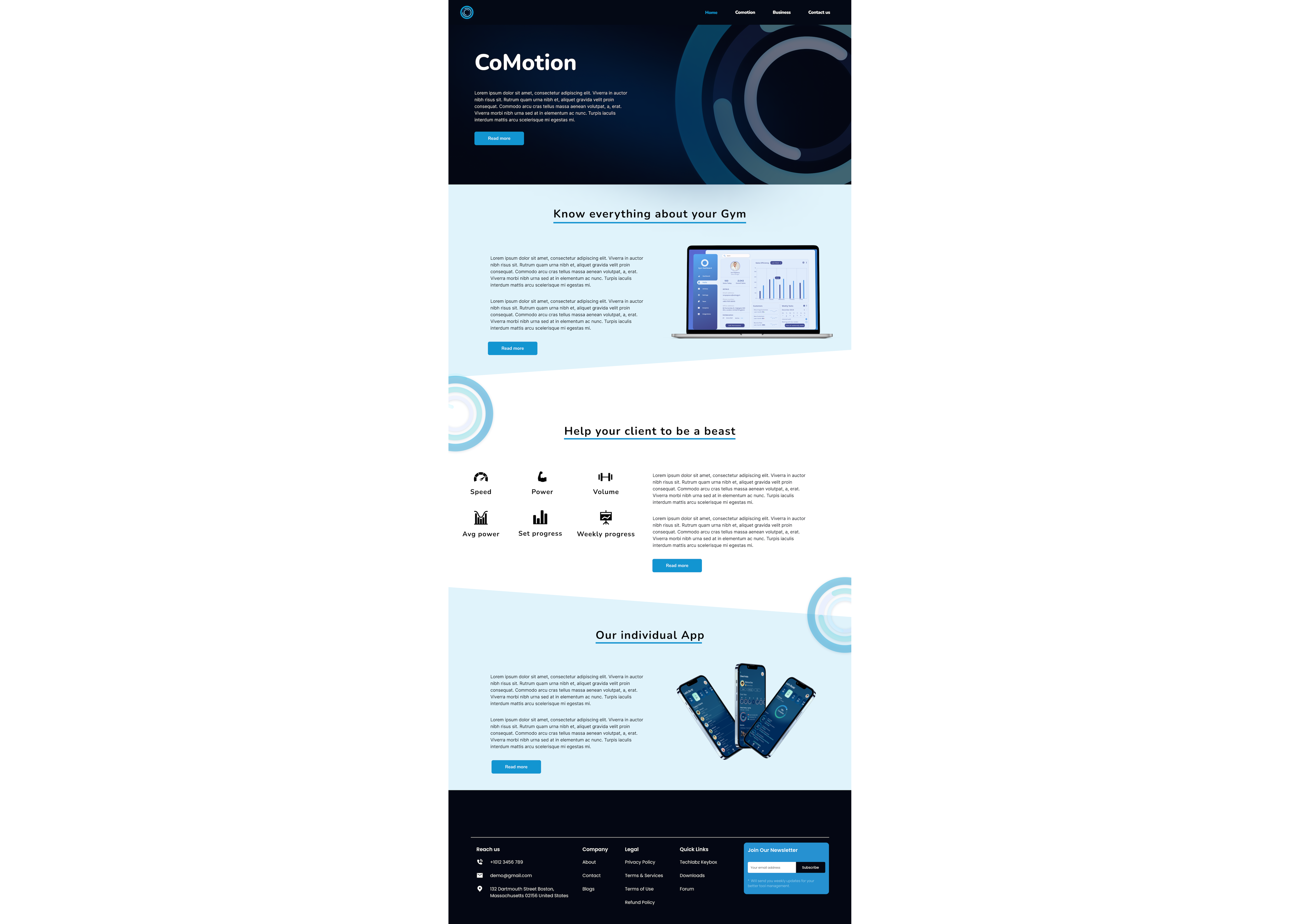
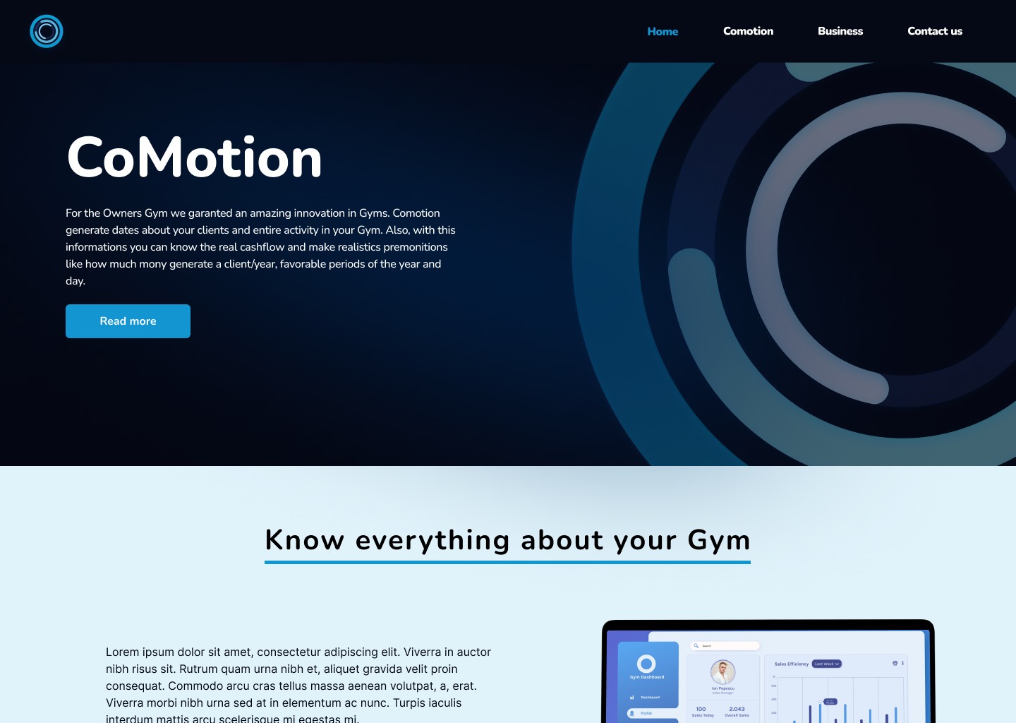
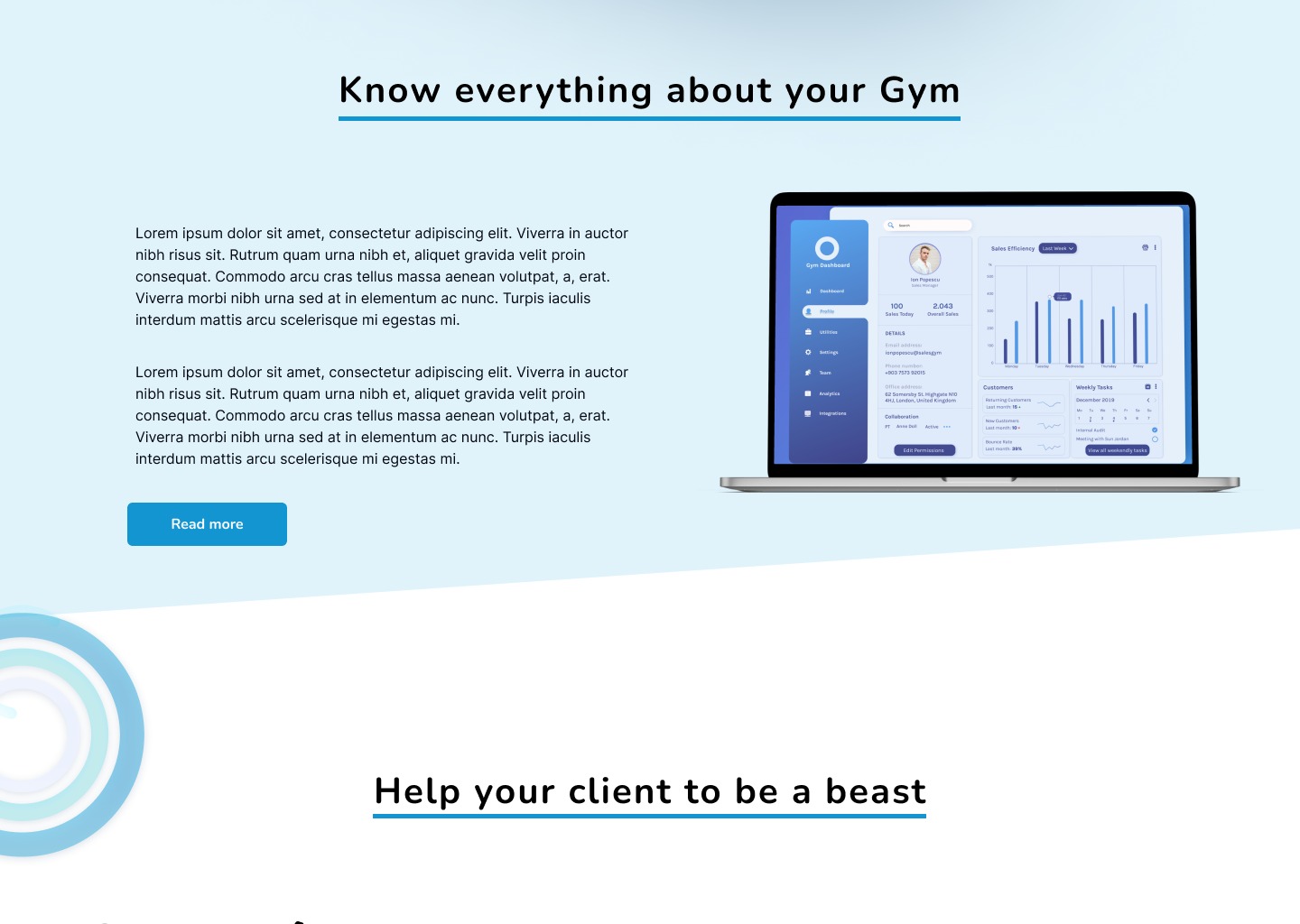
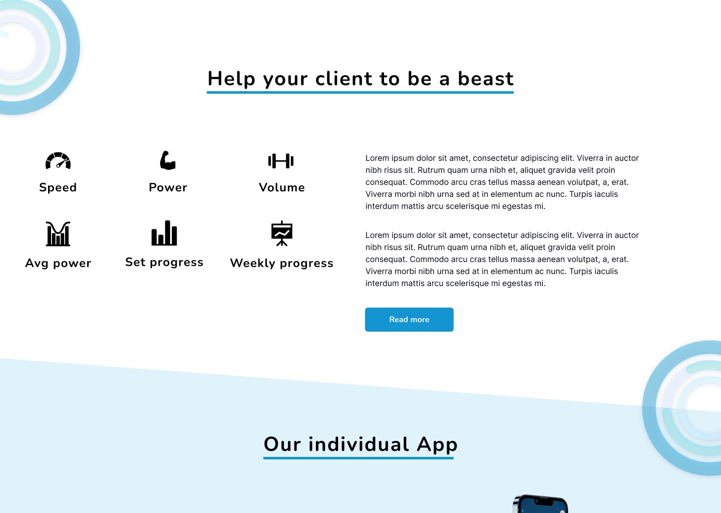
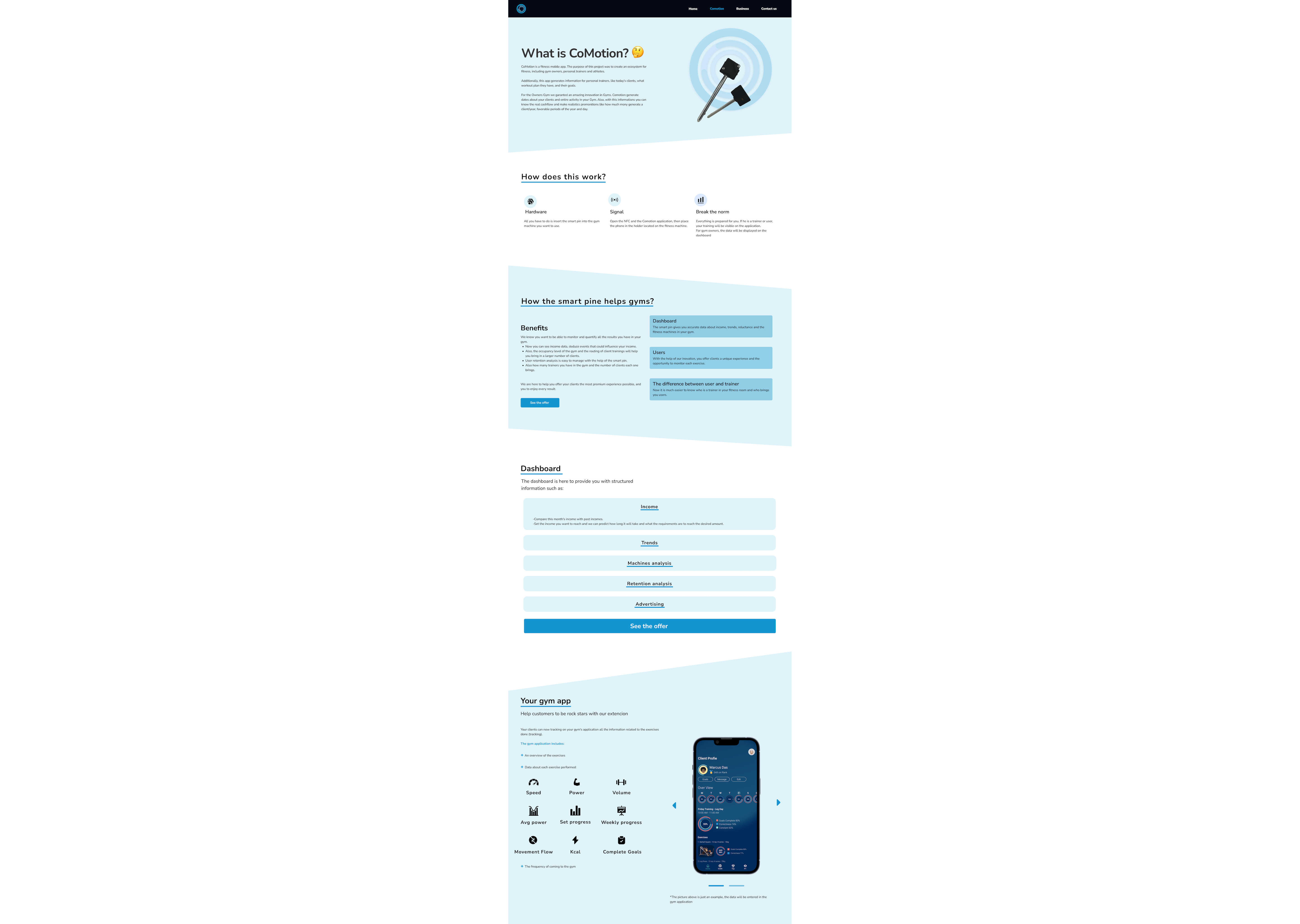
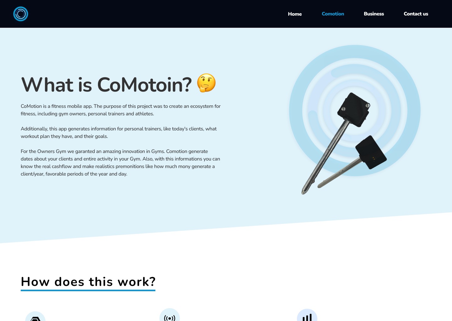
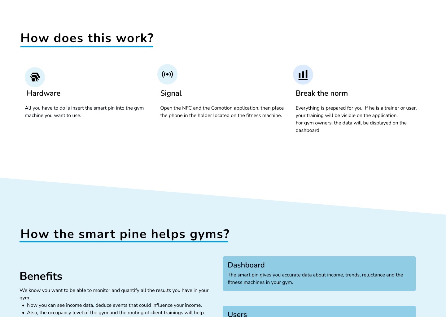
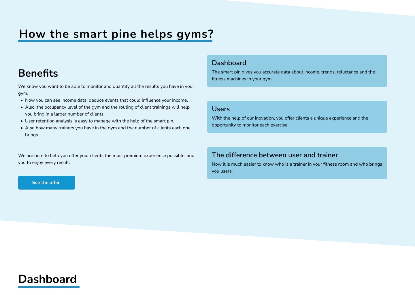
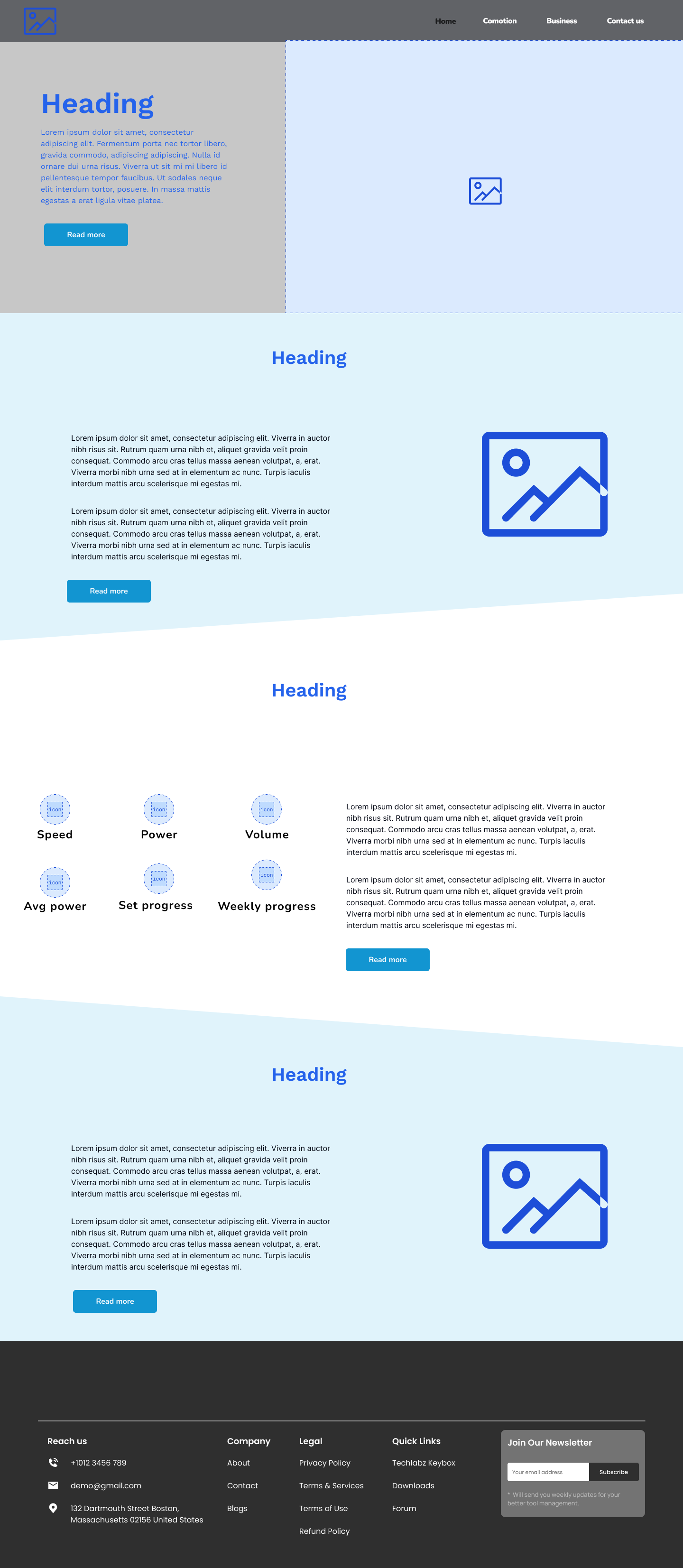
- For the site, I had to create a simple interface, which would focus on information and which would not distract much attention from the complexity of the concept.
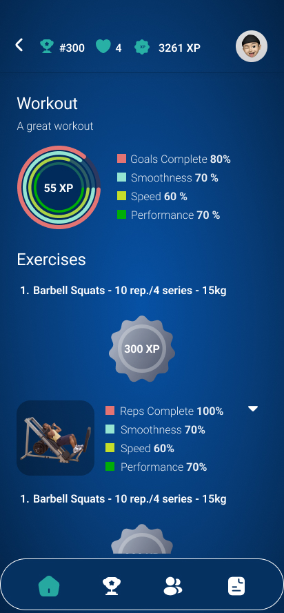
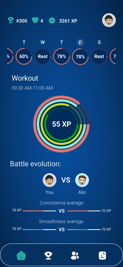
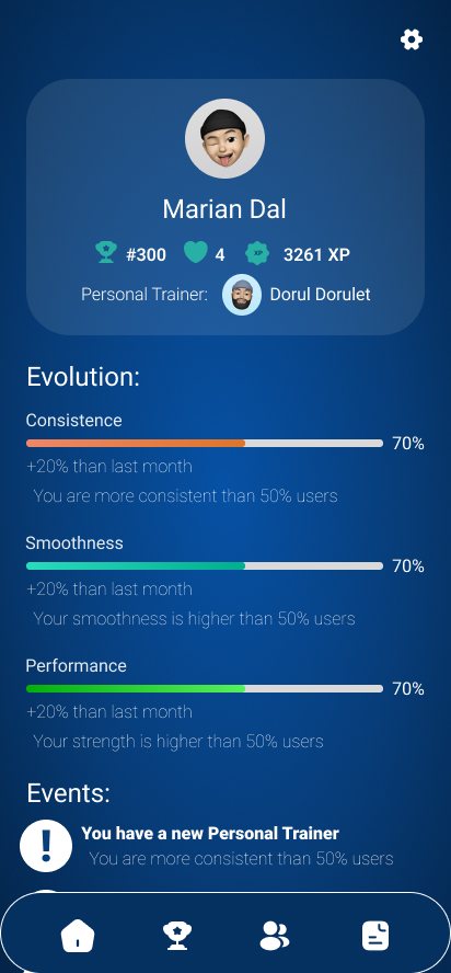
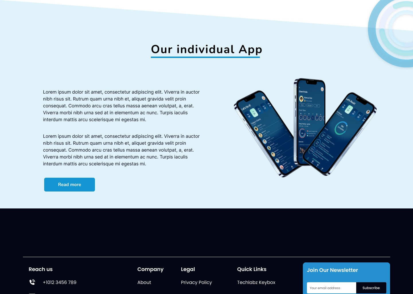
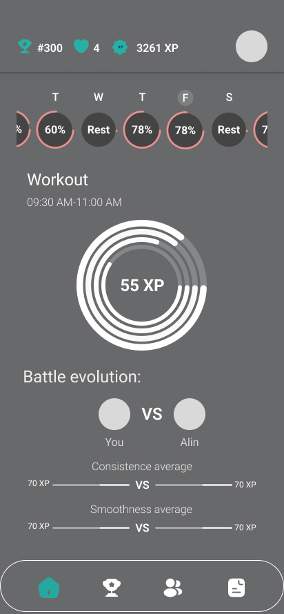
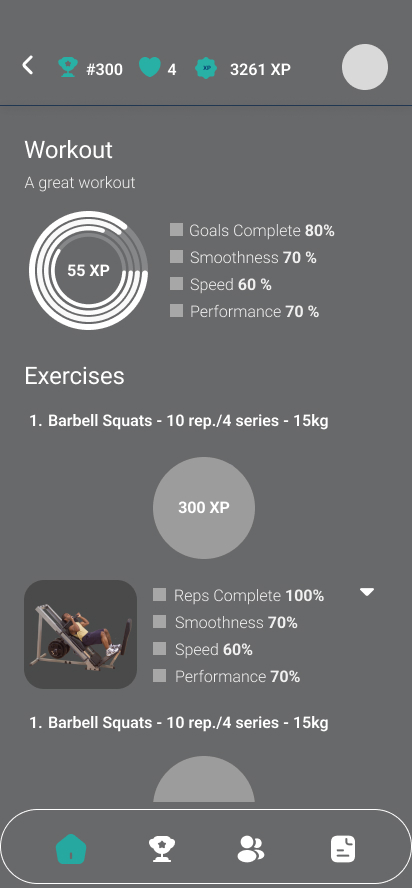
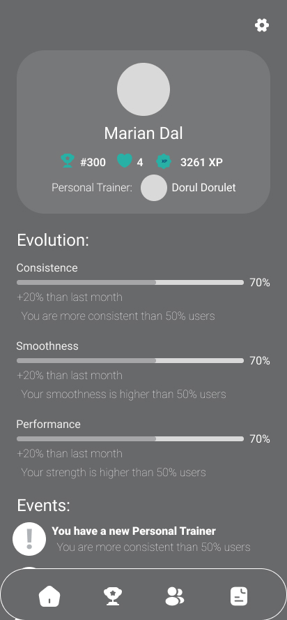
- For the application, I had to be careful that the charts were easy to understand, the information was placed in the right place, and the links between the exercises and the information related to them were easy to read
Problem
I have to build a solid image of the concept/business. As a result, an easy-to-understand presentation site is needed, which includes all the key information and is easy to navigate and understand. On the other hand, the application must be for users who go to the gym. As a result, a lot of informative information must be included, the exercises must be visible, and the exercise tracking must be easy to access and see.
Goals
- the creation of an easy-to-understand presentation site, aimed at gym managers
- creating an application that contains a constant visual system, where the information is easy to access both for those who go to the gym and for personal trainers.
Personas
To reflect the fact that Comotion is an ecosystem aimed at different types of stakeholders, I have selected personas from three relevant population segments (managers, peronal trainers and gym-goers).
These are the personas:
User Pain Points
-
Managers
- he cannot quantify the activity he has in the gym
- he cannot know how many functional fitness machines he has
- he cannot figure out the exact number of people he has in the room
-
Personal Trainers and Users
- Personal trainers cannot easily find clients and clients cannot easily find personal trainers
- They need accurate data about the physical activity they do in the gym
- They need external motivation
User Journey
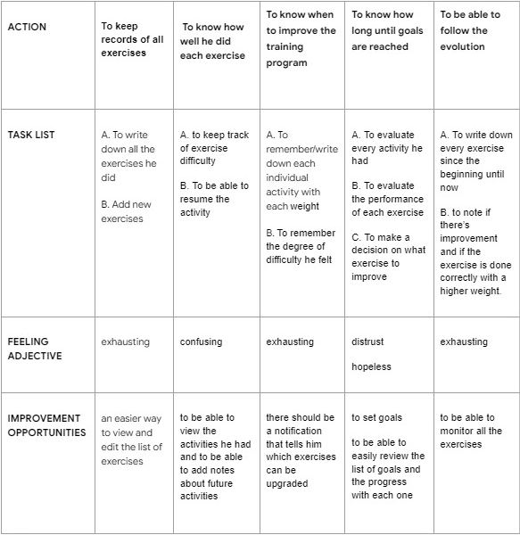
I justified all actions that interviewees have pointed out and tried to see how their lives can be improved both by the product but also by a user interface that would facilitate the transition to a new way of managing and displaying information.
Building a user journey has helped us emphatise with the clients and see the issues that they might encounter when trying to complete their tasks.
Wireframes
Website

App
Results
Website
App


Conclusion
The finished UI is a result of understanding and addressing all of the user's pain points.
In terms of UX, we managed to compress complex information into an intuitive application, with a dynamic interface, both for the trainees that want to check on their personal progress and compete with others, as well as for the personal trainers that would like to optimise their workflow with existing clients but also and find new clients with ease.
In regards to the landing page, aimed at presenting the business to the world, I managed to give it a simple, readable interface, making the content easy to navigate and understand
